Appkit 3.0 Design (Design System)
Role
Design Lead
Project Scop
Internal Design System
Team
Cross-functional team:
PM,
UX designers,
Engineers
Client
PwC US
Step 03
Design
A layered system for scale
Appkit was structured using Atomic Design principles, organizing the system into foundations, components, and patterns to support clarity and reuse across platforms.
Foundations established a single source of truth through shared tokens for color, typography, and spacing. Components were designed with clear constraints and extensibility in mind, reducing unnecessary customization while allowing teams to adapt to real product needs. Patterns captured recurring solutions, enabling teams to move faster with greater confidence and consistency.
This layered approach reinforced both design quality and delivery speed at scale.
Design language
Color
To comply the PwC branding visual guidleine, Appkit allots for three brand colors (primary, secondary, and extended). Each color has a lighter and darker shade with the token addition of -lighter or -darker added to its name. Next follow the neutral colors such as white, black, and shades of gray. Functional colors were also included, to be used for form errors, status warnings, and more.


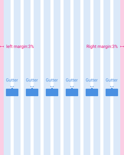
Grid
The grid provides the fundamental groundwork for placing visual elements. Working on the grid ensures a standard direction for creative decision-making across products and a responsive framework for design on different devices. It makes an app look coherent, enhances visual hierarchy, and balances design.

Grid - big screen

Grid - small screen
Grid - mobile
Breaking points & Interactive layouts
For optimal user experience, Appkit user interfaces should adapt layouts for the following breakpoint widths: 576, 768, 992, 1200dp and display with this interactive layouts across desktop, mobile, and tablet.

.png)

.png)
Typography
Clear typographical hierarchy organizes and structures content, making it easy for people to find their way through an experience.


Icon
Icons represent concepts, objects, or actions, and have semantic purpose within a layout. They should always be recognizable, functional, and easily understood.

Step 01
Discovery
Defining a scalable system problem
PwC had design guidelines in place, but they weren’t built to scale with a rapidly growing, multi-platform organization. Designers frequently detached component instances to meet immediate needs, leading to fragmented usage, duplicated patterns, and inconsistent experiences across products.
The absence of shared design tokens and a clear source of truth also created friction between design and engineering, slowing delivery and increasing rework. This revealed a broader systems problem: consistency, speed, and collaboration were being traded off instead of reinforced.
Appkit was initiated to address this gap by establishing a scalable, shared foundation that could support both product teams and long-term organizational growth.
Step 02
Preparation
Grounding decisions in proven systems
Before defining Appkit, I studied mature design systems across the industry to understand how they balance flexibility, consistency, and contribution at scale. This included analyzing how foundations, tokens, and governance models are used to support evolving product ecosystems.
Revisiting core design system principles helped clarify Appkit’s role—not just as a component library, but as an internal product that enables alignment, decision-making, and efficient collaboration across disciplines.

Project Overview
I led the creation of the AppKit design system for PwC China and the US teams. The goal was to streamline design workflows, reduce end-to-end delivery time, and establish a shared foundation for scalable product development. AppKit standardized reusable components, typography, spacing, and layout principles, enabling teams to deliver consistent, high-quality experiences while improving collaboration between design, product, and engineering.

Components
I designed components and variants for most frequently needed design elements such as: buttons, images, videos, accordions, tables, forms, cards, products, modals, and navigational controls and pagination. (Due to space limitations, only selected components are listed as examples.)
Accordion

Button

Calendar

Dropdown

Fields

Modals

Search

Tables

Toggles, Radios & Checkbox

Step 04
Operations
Governance, contribution, and shared ownership
Critique and review processes
Sustaining Appkit required clear governance without creating bottlenecks. Design critique and review processes were formalized to surface component changes early, align design and engineering, and reduce unintended system creep.
Shared ownership
Contribution standards were supported through Figma branching, allowing teams to propose and validate changes without disrupting the core system. Ownership was intentionally shared with engineering, including the establishment of a dedicated role to maintain the coded component library and align design tokens with implementation.
Clear, centralized documentation
Clear, centralized documentation—across Figma and Storybook—ensured the system remained accessible, understandable, and actively used, enabling Appkit to evolve as a shared organizational asset.