Usability study
A moderated usability study was conducted with participants representing both target personas.
Research Questions
-
How long does it take for a user to find a specific artwork?
-
Are users able to successfully have a virtual tour and discover what they are interested?
-
What can we learn from the steps users took to search a keywords?
-
Are there any improvements for the virtual tour experience?
-
Is the whole process easy for the end-user?
Participants
5 participants
Participants between the ages of 18-55 who reside in GTA areas. Some of participants visited the AGO before.
Methodology
20-30 minutes
Ontario, Canada, remote Unmoderated usability study
Users were asked to use virtual tour of AGO app on a low-fidelity prototype
Accessibility considerations
Accessibility was embedded throughout the design process:
1
Using the plugins in Figma to enhance the color contrast, which meets WCAG AA, requires a minimum ratio of 4.5:1 for normal text, 3:1 for headings, and 3:1 for non-text content, such as icons.
2
Keep the hierarchy and layout of the page logical and organized, and make sure key information is visible at a glance and follows a consistent and coherent structure.
3
Leaving enough room to breathe between lines of text and images helps the user focus more on what is important.

ROUND 1 FINDINGS
-
4 out of 5 total participants said they wanted to filter the results to drill down into subsets.
-
3 out of 5 total participants expressed a desire to sort the results in certain criteria, such as most popular, newest.
ROUND 2 FINDINGS
-
3 out of 5 total participants said they wanted to view the list of Artists in both grid and list views.
-
4 out of 5 total participants expressed a desire to filter the artists in some categories.

AGO Virtual Tour App
Role
UX designer
Timeline
1 month
Platform
Mobile native app
Skills
User research
Prototyping
Visual design
Usability testing
Business Goal
The goal of this project was to create an engaging and accessible virtual tour experience for the AGO. The app allows users to explore exhibitions remotely, deepen their connection with art, and encourage physical visits through an immersive digital preview.

Conducted qualitative and quantitative research to understand user needs and pain points related to virtual museum experiences.
-
Interviews & surveys helped uncover motivations such as learning, exploration, and convenience.
-
Competitive analysis identified opportunities for more intuitive navigation and stronger storytelling through visuals and audio guidance.
-
Key insight: users wanted a seamless, informative, and emotionally rich experience that mirrors an in-person gallery visit.
User Research
1
Pain point
Some of art galleries are too far to visit, like National Gallery of Canada
2
Pain point
Users don’t have enough time and money to explore artworks at galleries.
3
Pain point
The traditional gallery app is not quite intuitive, it may be difficult to locate the artwork where the end-users is interested.
4
Pain point
Users need a easy way to find the artists whom they are interested with.


Personas
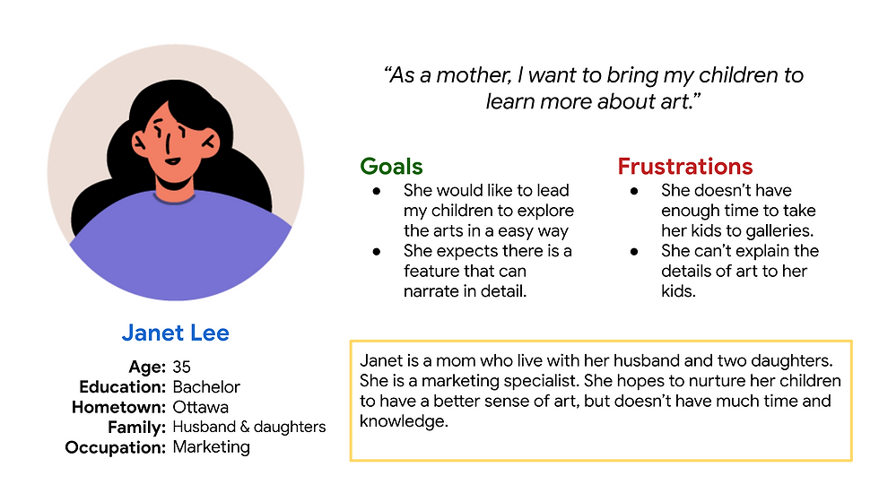
Based on the research, I developed personas representing two main audience types:
-
Art Enthusiast: values deep engagement with exhibits and curatorial context.
-
Casual Visitor: seeks an easy, visually-driven experience to explore artworks at their own pace.
These personas guided design decisions on navigation depth, content hierarchy, and tone of information.
The journey map visualized how users discover, interact with, and revisit the virtual tour. It highlighted emotional peaks and friction points, such as onboarding clarity and loading speed, leading to opportunities for improvement in the prototype phase.
User Journey Map

Designing a few paper sketches to sort the main user flows out, and get some insights about how to present the information for each screen.
Paper wireframes

Digital wireframes
Digital wireframes explored layout, interaction flow, and content placement. This iterative approach enabled rapid feedback and early testing before committing to detailed visuals.

Review the interview recordings and notes to identify key themes and insights. Organizing and analyzing information by grouping similar ideas into themes.
Refining Design

Before

After
